

Capelin of course! :) But there are quite a number of beach rocks in this painting as well. I don't know what the final name for the piece will be, but it will come to me eventually.
I wanted to create a fish piece to tie in with the two capelin girls in the water that I previously completed. These were the fish being harvested and in the water that day at the beach and I found some lying on the rocks and had done some sketches as well as taken a few photos of them as well. I just love these little fish. The size, shape, colour, everything fascinates me. I felt a little sad that these fellows were out of the water, but knew they'd be preserved in a painting and live on somehow and gave them a silent thank you for their sacrifice.

I drew the fish and stones on a 12" x 12" canvas panel and started adding colour. I usually build layers and take my time in pieces like this where precision is required pretty much to get the realism I want.
I'm not sure which part I'm enjoying painting more, the fish or the rocks. Both provide a challenge, perhaps more so in the smooth stones as I haven't painted a lot of those. But one by one, I examine them, check colours and add layers.
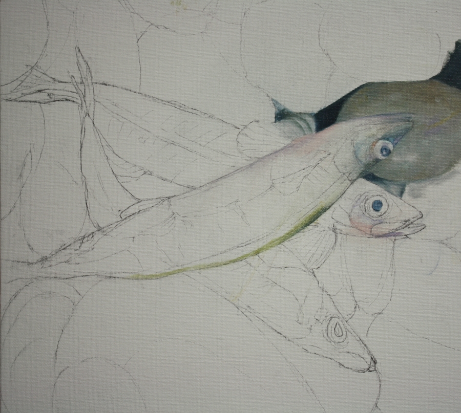
I find that I'm using the same colours in the stones as I do in the fish which ties them together well. And as in nature, animals or fish often mimic their environmental colours as a protection factor, so the colour theme is natural.
As I wanted to sit instead of stand when I painted this, I created my own vertical palette to keep the paint out of my way but handy, if that makes sense. I bought a couple of cheap plastic translucent cutting boards, the lightweight, flexible kind and pinned one to the wall beside my table easel. I squeeze smaller amounts of paint onto the surface and it doesn't move. I can mix on the surface and clean it easily, but its cheap enough to be disposable if wanted after the painting is complete. (I think they were about 50 cents each in the Dollar Store)

I like having the colour mixing at eye level and against the white wall it works well, even if the plastic over the white gives a slight greyish tinge. I may insert a piece of darker grey paper behind the plastic to give more contrast for colour mixing.
So this is my basic "fish" palette of colours. The "L" shape of colours from the top left going down and then right is asphaltum, ultramarine violet, olive green, indigo, manganese blue, light turquoise, cold grey deep, natural yellow ochre, rose grey and titanium white. I have also added cadmium red to the palette. The swatches are simply my mixes for painting. My paint brands are predominantly KAMA Pigments, but I also have Gamblin, Daniel Smith and Winsor & Newton on the palette as well. I find that its always an experiment, finding the right colour that a company produces then if you like it, sticking with it. Predicatability can be a good thing in some aspects of painting.
